Life Stages Realty
Channel Letter Sign Design
Project Overview
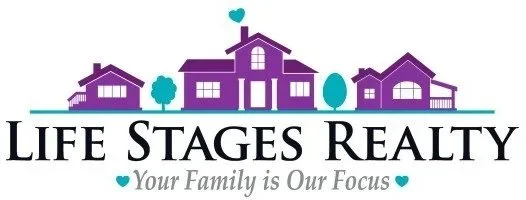
This project involved adapting the existing visual identity of Life Stages Realty into a physical channel letter sign for the company’s storefront. The goal was to create a sign that maintained the recognizable elements of the company’s logo while meeting the practical requirements of the building and ensuring the business could be easily identified from the street.
The project required balancing several stakeholders' needs. The Life Stages Realty owner wanted the sign to remain faithful to the existing logo, including the illustrated houses and heart, while the landlord had specific restrictions regarding the overall size and available space. As the designer, I also needed to consider the sign’s visibility and legibility from the street—requirements that sometimes conflicted with the other design constraints.
Design Challenge
The primary challenge was fitting the detailed elements of the existing Life Stages Realty logo into a limited sign area. The houses and heart were important components of the brand identity, but keeping every element at its original proportions significantly reduced the available size of the lettering.
Because the sign needed to function as more than just a reproduction of the logo, I had to consider how the design would actually perform in its environment. Smaller lettering and excessive detail could make the sign difficult to read from passing traffic, while removing too much of the original artwork could compromise the company’s established identity.
This required finding a balance between brand recognition, physical limitations, stakeholder requirements, and visibility.
Design Direction
I began with the existing Life Stages Realty logo and explored how its primary visual elements could be translated into a channel letter application. Rather than simply reproducing the logo at a smaller scale, I refined the composition to prioritize the elements that were most important to the brand.
The illustrated homes, trees, and heart were retained as key visual identifiers, while the typography was adjusted to work more effectively within the available space. The existing purple and teal color palette was maintained to preserve consistency with the company's established branding.
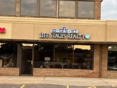
The storefront application also required consideration of how the sign would interact with the building's façade. The final composition needed enough visual presence to stand out against the neutral exterior while remaining within the landlord's restrictions.
Typography & Composition
Typography became one of the most important considerations in the redesign. The original logo contains multiple visual elements competing for a relatively limited amount of horizontal space. By simplifying and adjusting the logo's proportions, I was able to give “LIFE STAGES REALTY” greater prominence without completely removing the illustrative elements that make the brand recognizable.
The houses and heart were treated as supporting graphic elements rather than allowing them to compete with the company name. This created a clearer hierarchy and allowed the business name to remain readable while still preserving the personality of the original logo.
Final Concept
The final sign was an edited adaptation of the original Life Stages Realty logo, specifically developed for the physical storefront environment. The finished design successfully balanced the company's desire to preserve its existing identity with the landlord's space restrictions and the practical need for street-level visibility.
Rather than treating the project as simply converting a logo into channel letters, I approached it as an exercise in design problem-solving and stakeholder collaboration. The final result maintained the recognizable character of Life Stages Realty while creating a sign that was appropriate for the building, readable from the street, and acceptable to everyone involved.