
Oakland Nursey
Design Direction
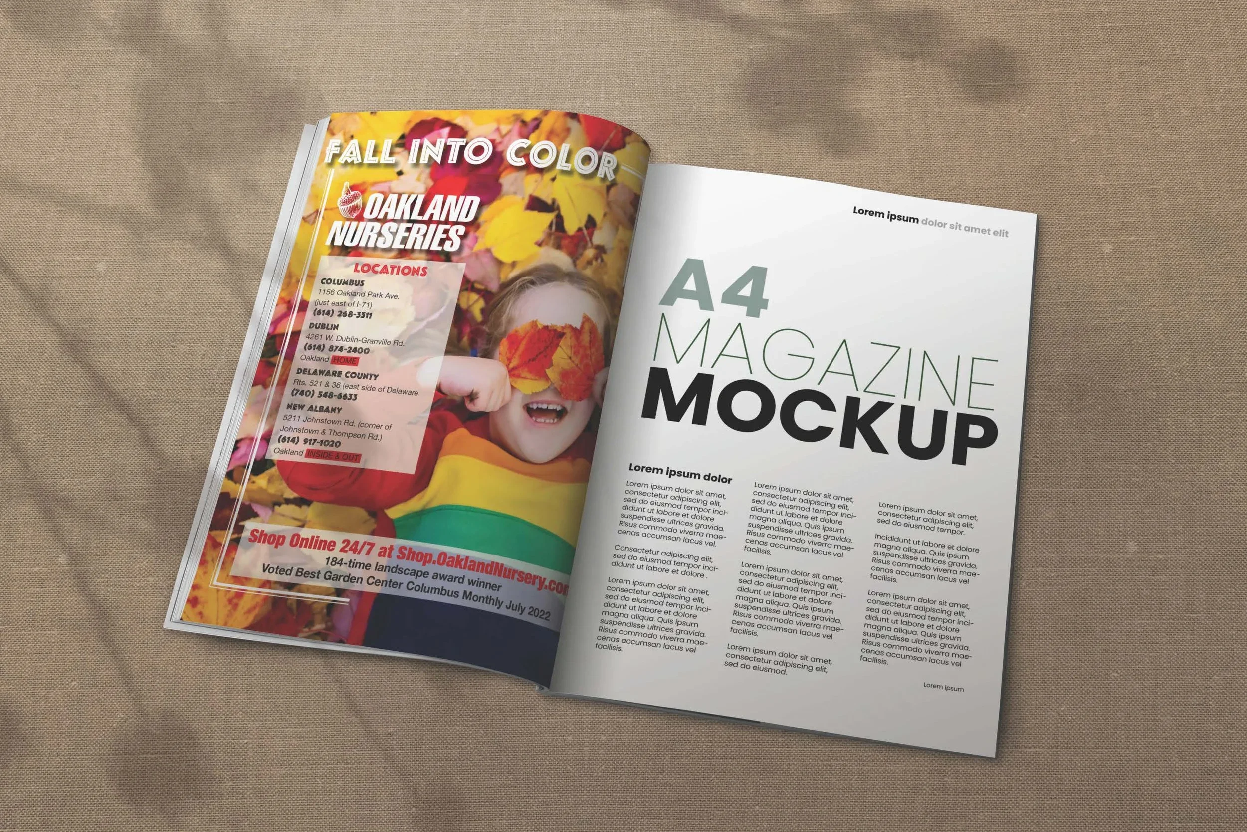
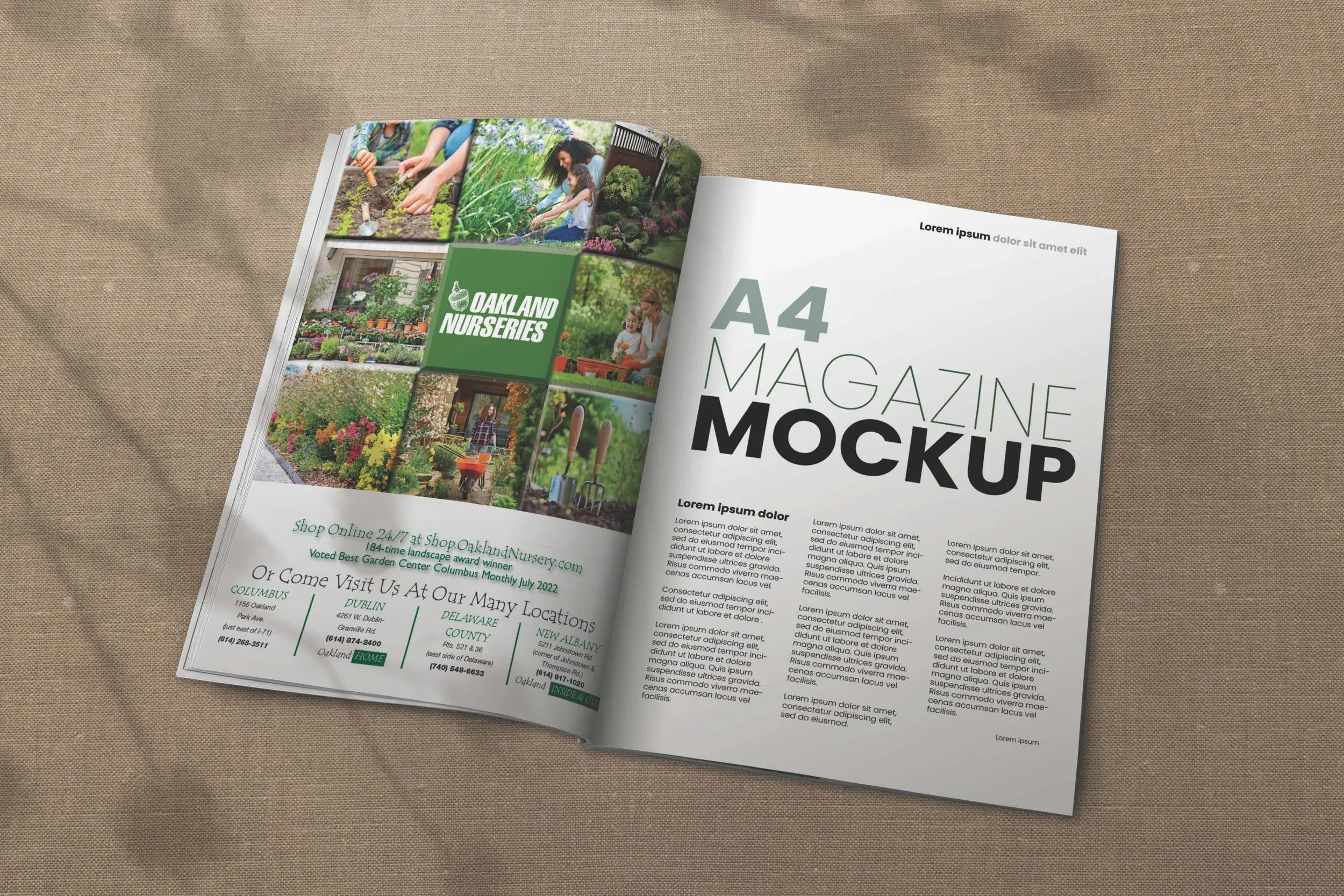
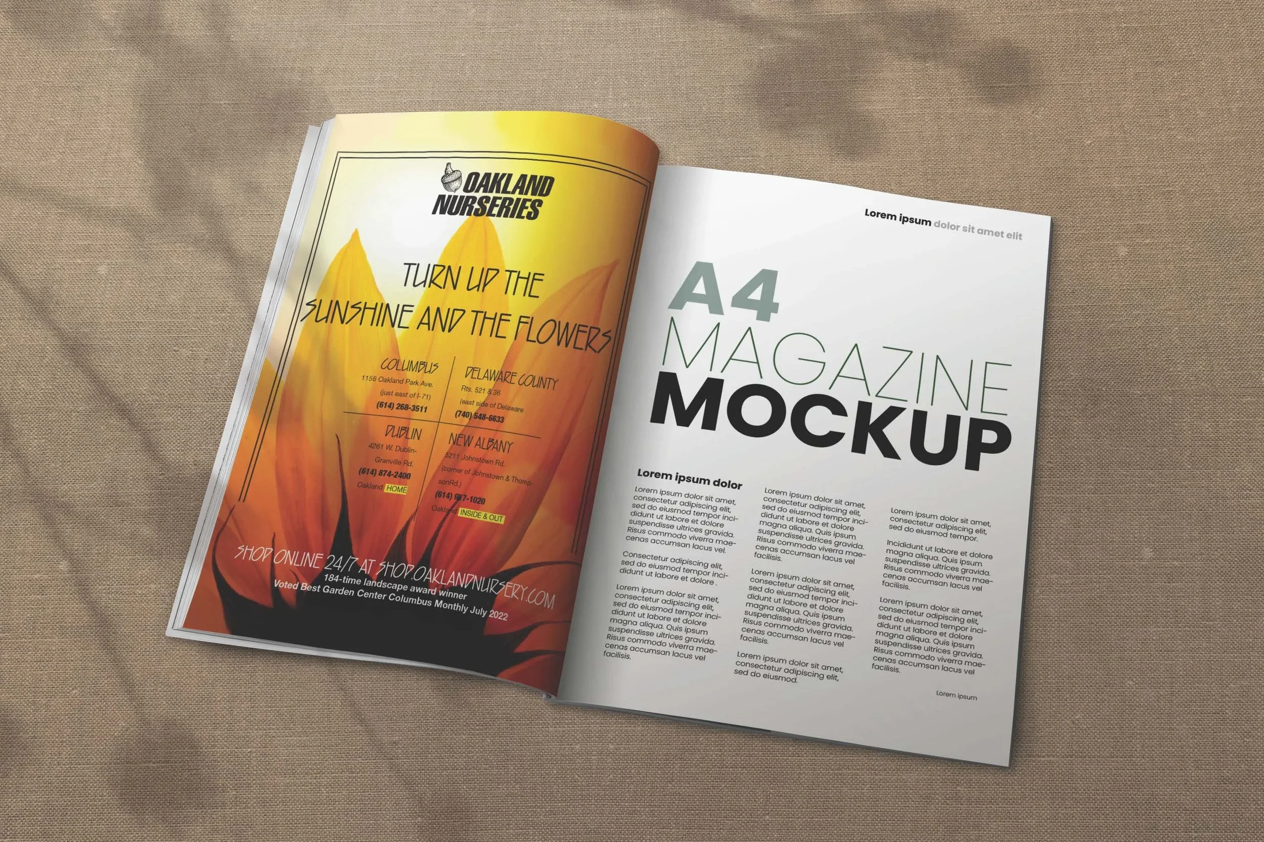
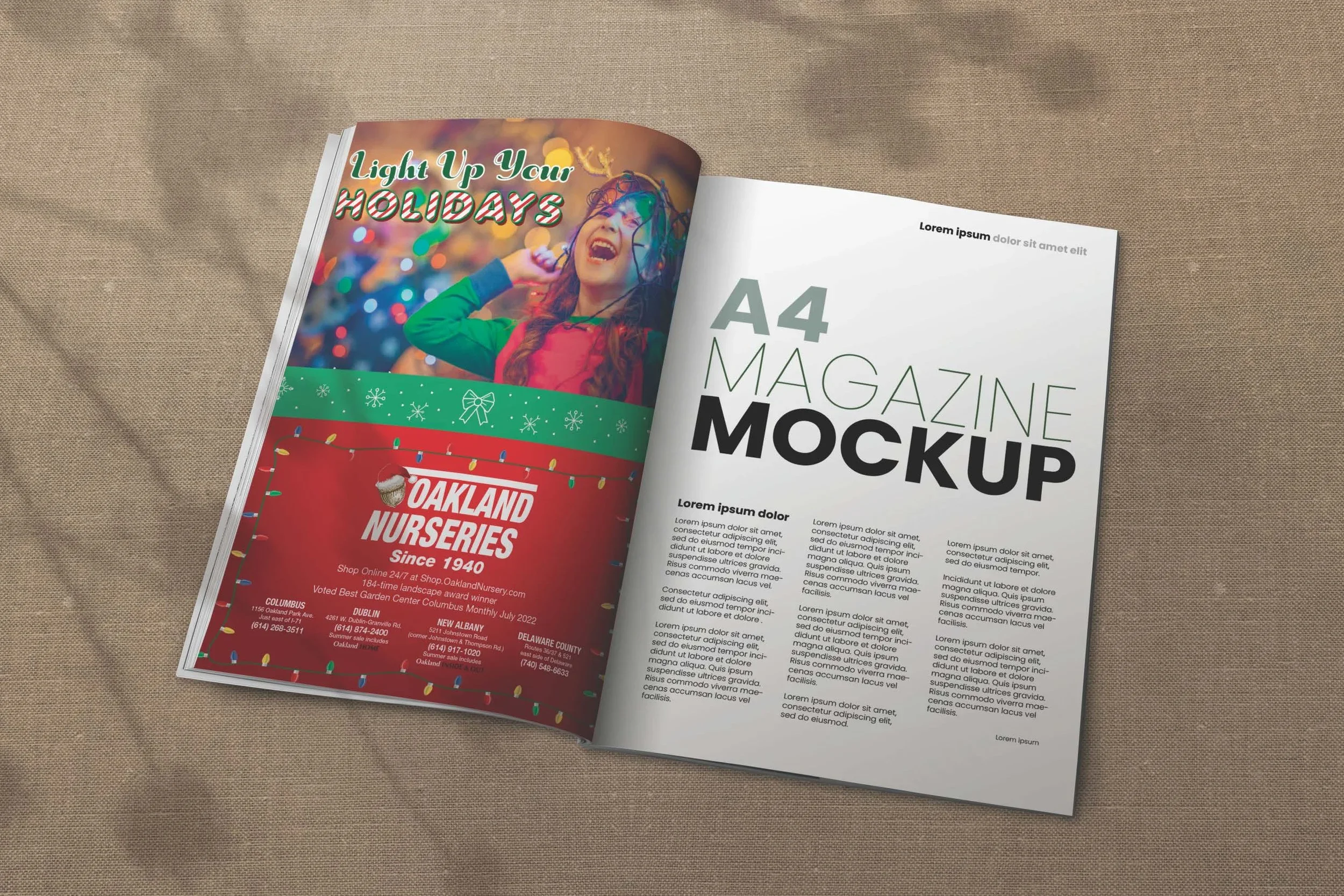
I approached the advertisements as a small seasonal campaign, using imagery and color to communicate the feeling of each time of year. Rather than creating four completely unrelated designs, I maintained consistent branding elements across the advertisements so they would feel like part of the same campaign.
For the fall advertisement, I focused on warm autumn colors, seasonal foliage, and imagery associated with the changing leaves and fall gardening. The Christmas advertisement uses holiday lights, festive colors, and winter imagery to create a more celebratory atmosphere. The summer advertisement uses bright colors and floral imagery to emphasize the warmth and vibrancy of the gardening season.
The general advertisement takes a more product- and community-focused approach, using a collage of gardening, landscaping, and family imagery to communicate the variety of products and experiences available at Oakland Nurseries.
Final Concept
The final campaign consists of four magazine advertisements designed to give Oakland Nurseries a consistent but flexible presence throughout the year. Each advertisement responds to its specific season while maintaining recognizable branding and a cohesive visual style.
Together, the fall, holiday, summer, and general advertisements demonstrate how one brand identity can be adapted to different campaigns and audiences while keeping the overall look of the business consistent.
Typography & Composition
Typography was adapted for each advertisement to complement its specific seasonal theme. Large headlines were used as the primary attention-grabbing element, while supporting information such as locations, website details, and promotional messaging was organized around the imagery.
Each ad uses a combination of photography, graphic elements, and typography to create a strong visual hierarchy. Seasonal colors and decorative elements help establish the mood while the Oakland Nurseries branding remains consistent throughout the series.
The advertisements were also designed with magazine placement in mind, making sure the most important information could be quickly understood by someone viewing the page while still creating an engaging visual.
Project Overview
This project involved creating a series of seasonal magazine advertisements for Oakland Nurseries. The client asked me to develop several ads that could be placed throughout the year to promote the nursery, its products, and its multiple locations while keeping the overall brand identity consistent.
The campaign included four different advertisements: a fall-themed ad, a Christmas/holiday ad, a summer ad, and a general advertisement that could be used outside of specific seasonal campaigns. Each ad needed to feel visually distinct and appropriate for its season while still being immediately recognizable as Oakland Nurseries.