Snyder Farms Rebrand

Design Direction
I began the redesign by using the original Snyder Farm logo as a foundation rather than completely moving away from its established identity. The goal was to modernize and add character to the existing mark while maintaining enough familiarity for existing customers to recognize the business.
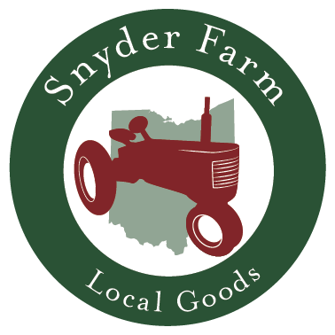
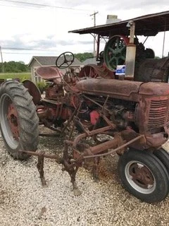
The tractor became the central visual element of the new logo. I incorporated an illustrated version of the client's 1930s tractor into a circular emblem, creating a visual connection between the farm's history and its current identity. The tractor illustration also gives the logo a more personal and authentic quality than a generic agricultural symbol would have.
The color palette was expanded from the original black-and-white design to deep green, red, white, and muted agricultural tones. Green connects the identity to farming, landscaping, and the natural environment, while the red tractor provides contrast and draws attention to the central graphic.
Brand Extension
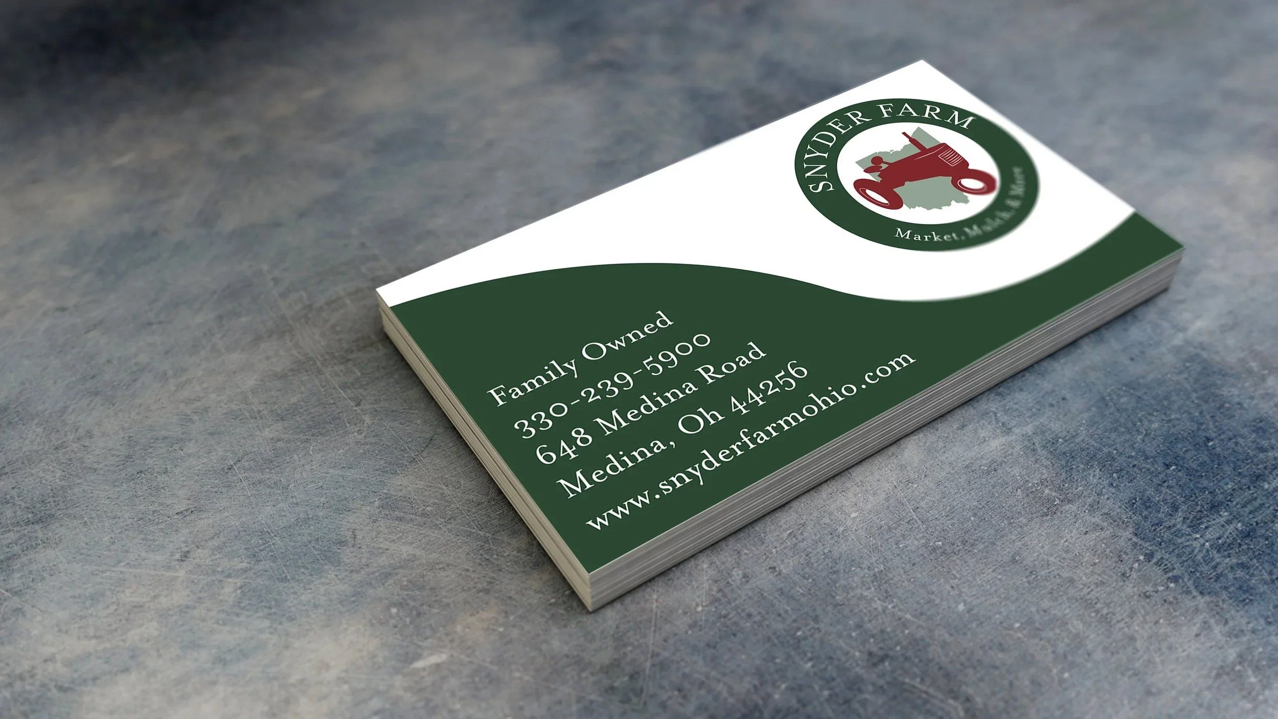
Once the new logo was established, I extended the visual identity into additional branded materials. The redesigned logo was applied to a business card, using the same color palette, typography, and visual language to create a consistent brand experience.
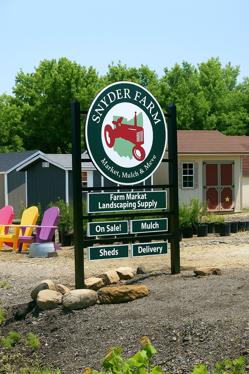
The business card design incorporates a clean layout with the farm's contact information while allowing the new logo to remain the primary visual focus. I also extended the identity into physical signage, demonstrating how the redesigned logo could work at a larger scale in a real-world environment.
Developing these applications helped create a more cohesive identity for Snyder Farm rather than treating the logo as an isolated piece of artwork.
Final Concept
The final identity transforms Snyder Farm's original basic black-and-white logo into a more distinctive visual system that reflects the history, personality, and agricultural roots of the business. Incorporating the client's 1930s tractor gave the redesign a meaningful connection to the farm rather than relying on a generic agricultural symbol.
The completed logo, business card, and signage demonstrate how a single identity can be carried across multiple applications while maintaining consistency. The result is a refreshed brand that honors Snyder Farm's existing history while giving the business a stronger and more recognizable visual presence.
Typography & Composition
The redesigned logo uses a circular badge composition with “SNYDER FARM” prominently positioned around the outside of the emblem. The typography was selected to create a traditional, established feel that reflects the farm's history while remaining clear and recognizable.
The tractor sits at the center of the mark, positioned over an Ohio-inspired background shape to further reinforce the farm's local identity. The circular structure creates a strong, self-contained logo that can be easily adapted across different applications and sizes.
Rather than treating the tractor as a separate decorative element, I made it the focal point of the identity. This allows the logo to communicate the personality and history of the farm at a glance.
Project Overview
This project involved a complete visual identity redesign for Snyder Farm, a local family-owned farm and landscaping supply business. The client approached me with an existing black-and-white logo that had been used by the business for years. While the original logo provided a recognizable foundation, the client wanted to give the identity new life and create a more distinctive and memorable look for the business.
A key request from the client was to incorporate their 1930s tractor into the redesigned logo. The tractor has significance to the farm and provided an opportunity to connect the new identity to the company's history while creating a stronger visual representation of the business.