Rastorfer Field — Sign Redesign
Rastorfer Field — Sign Redesign
Project Overview
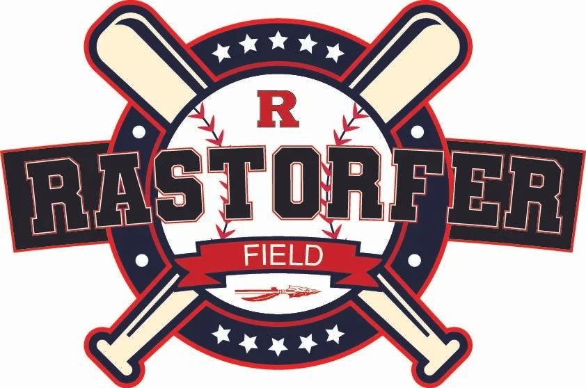
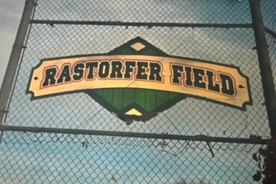
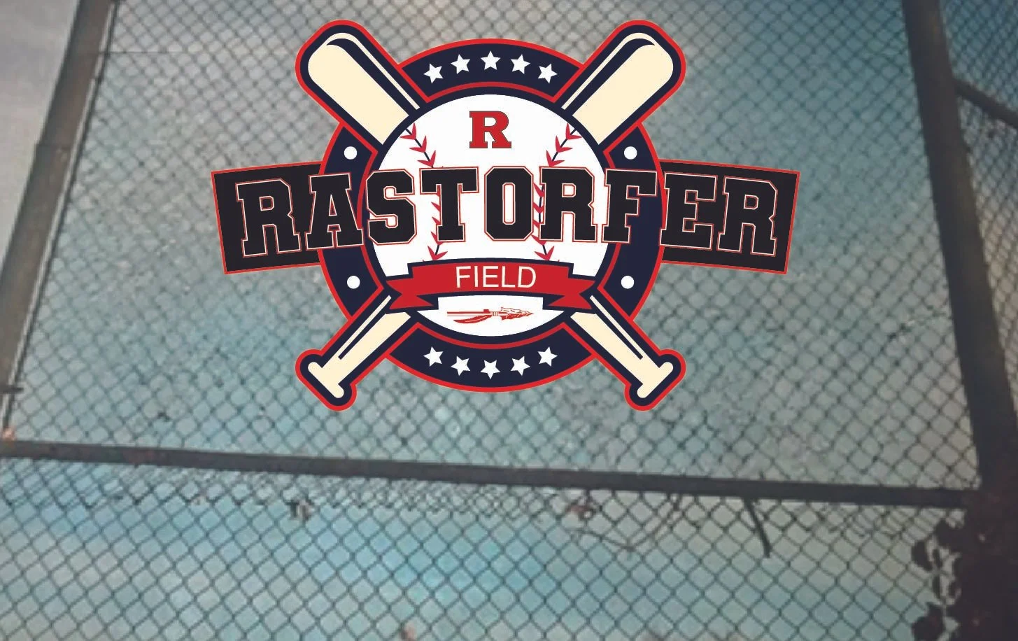
This project explores a visual identity redesign for Rastorfer Field, Rittman, Ohio’s local baseball field. The goal was to create a bold, cohesive sign that celebrates the history of the field while establishing a strong visual connection to Rittman athletics.
The field is named after Fred Rastorfer, a longtime contributor to Rittman’s sports community. Rastorfer spent nearly 30 years as an umpire and played an active role in supporting and improving local athletic facilities. In recognition of his contributions, the Rittman City Council named the baseball field after him in 2010. His continued involvement in community projects has made his name an important part of Rittman’s local legacy.
Design Direction
I approached the redesign with the visual language of traditional baseball graphics in mind, while giving it a cleaner and more contemporary feel. The crossed baseball bats, baseball stitching, stars, laurel elements, and banner create a layered sports identity that immediately communicates the purpose of the space.
The primary color palette of red, black, and white was intentionally selected to reflect Rittman’s school colors. Using the existing community color scheme creates an immediate connection between the field, local schools, athletes, and the larger Rittman community. Red provides energy and emphasis, while black creates contrast and adds weight to the typography and supporting graphics.
Typography & Composition
A bold, athletic display typeface was chosen for “RASTORFER” to establish a strong focal point and ensure legibility at a large scale. The oversized lettering stretches across the central composition, giving the sign a commanding presence. Supporting elements—including the “FIELD” banner, central “R” monogram, and surrounding baseball imagery—create a clear visual hierarchy while reinforcing the identity.
The crossed bats provide the foundation of the composition, while the circular badge and banner elements help organize the information into a unified emblem. Red outlines and layered strokes were used throughout the design to separate elements and create the dimensional, energetic quality associated with classic sports branding.
Final Concept
The final design combines local history, school spirit, and baseball culture into a single visual system. Rather than simply identifying the location, the sign is designed to feel like an emblem for the community—honoring Fred Rastorfer’s legacy while giving the field a recognizable and contemporary identity.